Design Research Methods
Postmodernism exhibition at the V&A
"Postmodernism" the movement of art, which is usually seen as the most controversial of all movements.
I was fascinated by the work that I saw at the V&A. The exhibition was filled with bold and bright designs...not to mention a few very unique styles!
The beautiful image of Grace Jones revised by Jean Paul Goude, automatically caught my eye. I decided to research this image further. Whilst researching, it came to my attention that the position in which Grace Jones is standing in is a ballet move and is known as an Arabesque. It is a known fact..apparently...that this position is not only impressive however is impossible!
So how did Grace Jones do it?
Goude quotes
"Unless you are extraordinarily supple, you cannot do this Arabesque. The main point is that Grace couldn't do it, and that's the basis of my entire work creating a credible illusion."
Goude photographed Grace Jones in a variety of positions using clear boxes to hold to up her body. He then combined the images in a montage, that created this amazing image.
If you think, today that could be done in five minutes on photoshop...that just shows the power of the past!
Barney Bubbles-
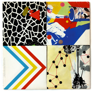
Armed Forces Album Sleeve for Elvis Castello
For me this work was more inspirational than fascinating. I felt that the concept for an album sleeve to unfold and reveal something special inside was intriguing, in comparison to album sleeves today! (if anybody even buys albums nowadays!)
In my opinion this layout was very interesting and I related it to an idea that Courtney and I had for our RSA leaflets.
The colours are bright and bold and they draw you in.
When following up on this work, I came accross the whole album sleeve...back to front...folds to flaps!
The album doesn't open at the side but the four brightly designed flaps unfold.
This then unfolds like origami!!!
How fascinating is that!!
My Business Design Process

RSA -In The round
This brief has been a real struggle. ALthough one good thing came out of it.... I realised that I worked really well in a group. Even though we all hated the brief, we stuck together and got through it. I am very proud of what we achieved, considering our brief was the worst one!!!! I'm just glad it over!
I am working in a group of 3, our task for this week was to design a mind map of ideas for an RSA project, In The Round. We have decided to work on certain sub headings individually and then merge all our ideas together in order to present the work on Friday. This is my work that I have been developing over the weekend.
The scenarios below are James May's toy stories. We felt that these videos worked really well with our brief and really shows a great summary of getting teenagers involved with PLAY!
Task 1: two designers that are inspirational to me
Patrik Boyer
I am inspired by Patrik Boyer’s designs, as they all have a distinctive style, however are extremely different. His unique illustrations portray a creative process. His use of detailed illustrations and striking colours are used to convey a specific message.
Below are a few examples of Patrik Boyer’s work that have inspired me.
Vasava Designs
This video was designed for the launching campaign of 55DSL xAdidas Originals trainers. The way in which the video has been composed is by using an urban up beat approach, with the use of bright colours and interesting animation.
This advertising campaign is from a series of visuals for Adobe. The design of this poster caught my eye due to the use of striking colours and intricate detail. This campaign is highlighting the power of Adobe's creativity and the use of tools that are available on their software.
This video was designed for the launching of the LVMH Hennessy in China. I feel this video attracts the target audience with its urban style and gives Hennessy a modern vibe.
This is an illustration created for the Republic Group. A slinky effect to compose two hands is what I found fascinating about this illustration. This gives the illustration a 3D effect, which I feel works really well with the use of the neon colours against a black background.
|


